
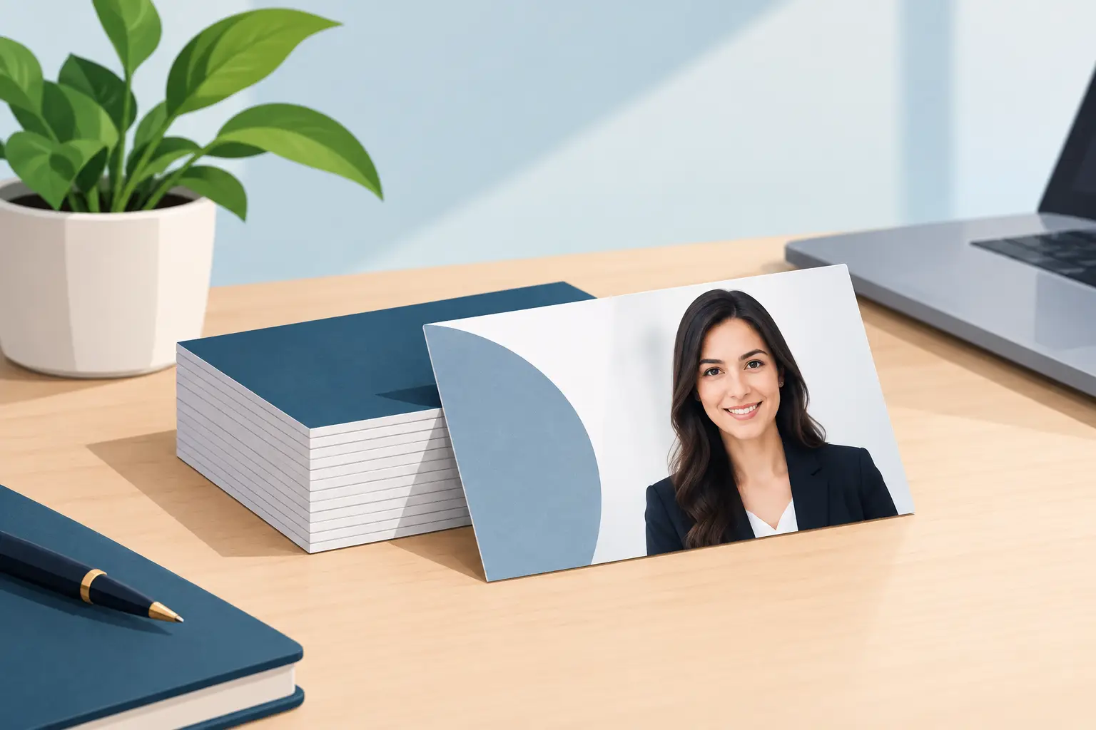
A business card is small, but the impression it creates is not. The best photos for business cards make it easy for someone to remember your face, connect it to your name, and feel confident contacting you after a meeting, showing, interview, or networking event. A rushed selfie or old group-photo crop can do the opposite, even when the rest of the card looks polished.
For professionals, realtors, entrepreneurs, job seekers, and client-facing teams, the right image is less about looking overly formal and more about looking approachable, capable, and current. The photo needs to work at a very small size, which changes what makes a portrait successful.
What Makes a Business Card Photo Work
The best business card image is usually a clean, professional headshot rather than a full-body portrait or a heavily styled branding image. Your face is the point. On a standard card, there is simply not enough room for a wide scene, busy outfit, or complicated pose to read clearly.
Choose a photo where your eyes are visible, your expression feels natural, and your face takes up enough of the frame. If someone has to squint to recognize you, the crop is too wide. A strong image typically shows the head and upper shoulders, with a little breathing room around the top of the head and sides of the frame.
The goal is recognition, not a dramatic magazine portrait. A business card should help a new contact think, “Yes, that is the person I met.” That is especially useful for realtors, consultants, financial professionals, lawyers, sales teams, and small business owners who rely on personal relationships.
Best Photos for Business Cards: Headshot Styles That Fit
A classic head-and-shoulders portrait is the most flexible choice for most people. It fits naturally into a vertical or horizontal card layout, remains clear when printed small, and can also be used for a company website, LinkedIn profile, email signature, and speaker bio. Investing in one well-planned professional headshot often gives you far more value than a single-use image.
A friendly, direct-to-camera expression is usually the safest option. Looking into the lens creates an immediate sense of connection. You do not need a huge smile if that does not feel like you, but a relaxed expression with warmth in the eyes is more inviting than a serious, guarded look.
A slightly angled pose can also work beautifully. Turning the shoulders a little while keeping the face connected to the camera often looks natural and flattering. It gives the portrait shape without making it feel stiff. This is where coaching during a session matters. Most people are not expected to know how to pose, and small adjustments to posture, chin position, and eye line make a noticeable difference.
For a creative professional or personal brand, a more environmental portrait may be appropriate. A designer in a studio, a realtor outside a bright property, or a business owner in their workspace can add context. The trade-off is that environmental images can become visually crowded on a card. If you use one, keep the background simple and make sure your face remains the visual focus.
Choose a Background That Supports Your Brand
A plain or softly blurred background is often the strongest choice. White, light gray, charcoal, warm neutral, or a subtle office setting can all work, depending on the design of your card and the feeling you want to create.
Light backgrounds feel clean and open. They are a good fit for modern, minimal card designs and can make darker clothing stand out. Darker backgrounds can feel polished and premium, particularly when paired with a simple light-colored logo or card stock. Neither is automatically better. The right choice depends on your industry, existing brand colors, and how the photo will sit on the layout.
Avoid backgrounds that compete with your face. Busy bookshelves, crowded events, street scenes, and harsh patterns may look interesting on a larger screen, but they can turn into visual noise once printed. The same goes for strong shadows across the face. A business card is not the place to make people work to see you.
If your company uses a specific color palette, consider how the photo will work beside it. You do not need to match the brand exactly, but a portrait with clashing colors can make the final card feel uncoordinated. A photographer can help you plan a background and wardrobe that leave the designer with flexible options.
Wear Something That Still Looks Good at Small Size
Your clothing should support your face, not become the main event. Solid colors and subtle textures generally print better than tight stripes, tiny checks, large logos, or high-contrast patterns. Those details can distract from your expression and may look uneven when reduced to business-card size.
For corporate and professional services, a blazer, polished shirt, blouse, or sweater in a color that suits you is a reliable choice. Realtors and entrepreneurs often have more flexibility, but the clothing should still reflect the level of service clients can expect. If you would not wear it to meet an ideal client, it may not be the best choice for your card.
Think about longevity too. A trendy outfit can date a photo quickly. Classic, well-fitting clothing gives your headshot a longer useful life. That does not mean you need to look generic. A signature color, favorite glasses, or a distinctive but simple accessory can help the image feel like you.
Crop and Layout Matter More Than Most People Expect
A great headshot can fail on a business card if it is cropped poorly. Never place your face so close to the edge that the trim cuts into your hair, chin, or shoulder. Printing has small variations, and a tight crop leaves no room for error.
Before finalizing the design, look at an actual-size proof. A portrait that feels large on a computer monitor can become tiny in print. Your name, job title, phone number, and photo all need room to breathe. If the card is overloaded with text, it may be better to use the photo on the back rather than squeezing it into a narrow corner.
Vertical portraits often work well on the side of a horizontal card or as the main feature of a vertical design. Horizontal portraits can fit a wide card, but they must be composed intentionally. Do not crop a landscape photo from the middle if it leaves only a sliver of your face.
If you are choosing between a close crop and a wider one, favor the closer version. At this scale, clear facial recognition is more valuable than showing more of the setting or outfit.
Use a Current, Consistent Image
Your business card photo should look like you now. If clients meet you in person after seeing your card, the image should not create a moment of uncertainty. As a practical rule, update the portrait when your appearance changes significantly, your role shifts, or the current photo is more than a few years old.
Consistency across your professional materials builds trust. Use the same photo, or photos from the same session, on your business card, LinkedIn profile, website, email signature, and marketing materials. People may see you in several places before reaching out. Repetition helps them recognize you more quickly.
For teams, a consistent approach matters just as much. Matching lighting, background, crop, and overall style makes a company look organized, even when employees have different personalities and wardrobe choices. It also makes future updates easier when new team members join.
When a Professional Headshot Is Worth It
A professional photo is not about making you look like someone else. It is about using good lighting, thoughtful composition, gentle direction, and professional editing to show your best, most believable version. These details are hard to replicate with a phone snapshot, especially when the final image will be printed and seen by potential clients.
Professional editing should be refined, not obvious. It can reduce temporary distractions, balance color, and improve the overall polish while keeping your skin texture, features, and expression recognizable. Over-editing is a risk because it can make a portrait feel artificial. A good headshot should still look like you on a good day.
At RP Photography, sessions are designed to be comfortable for people who do not enjoy being in front of a camera. Guidance is built into the process, so you are not left guessing what to do with your hands, shoulders, or expression. Studio and on-location options also make it easier to create an image that suits the way you work.
A Quick Test Before You Print
Before sending your card to print, shrink the design to its real size and ask a few simple questions. Can you recognize the face immediately? Is the expression clear? Does the background stay quiet? Does the photo still look sharp beside the text?
If the answer is no, adjust the crop or choose another image before committing to a large print run. A business card is often handed over in a fast, personal moment. Choose a photo that makes the follow-up feel just as easy.